LBG mobile banking
A simpler, more intuitive and better-looking banking app, starting with onboarding.
- Role
- Lead UI Designer
- Duration
- 18 months
- Location
- London
- Product
- iOS and Android apps

Give people a simple, secure and fast way to bank.
The brief
Simplify an existing app
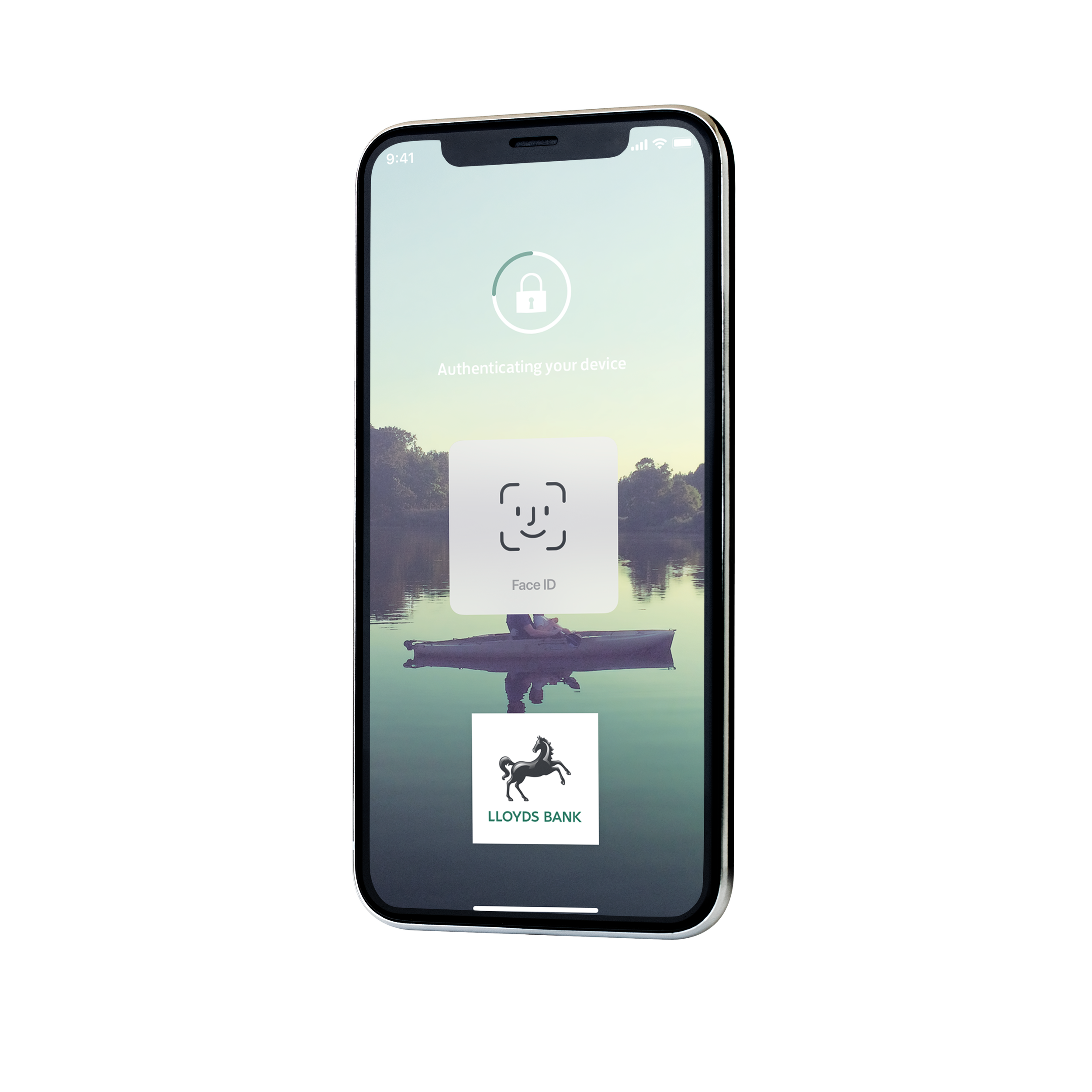
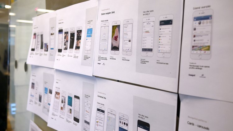
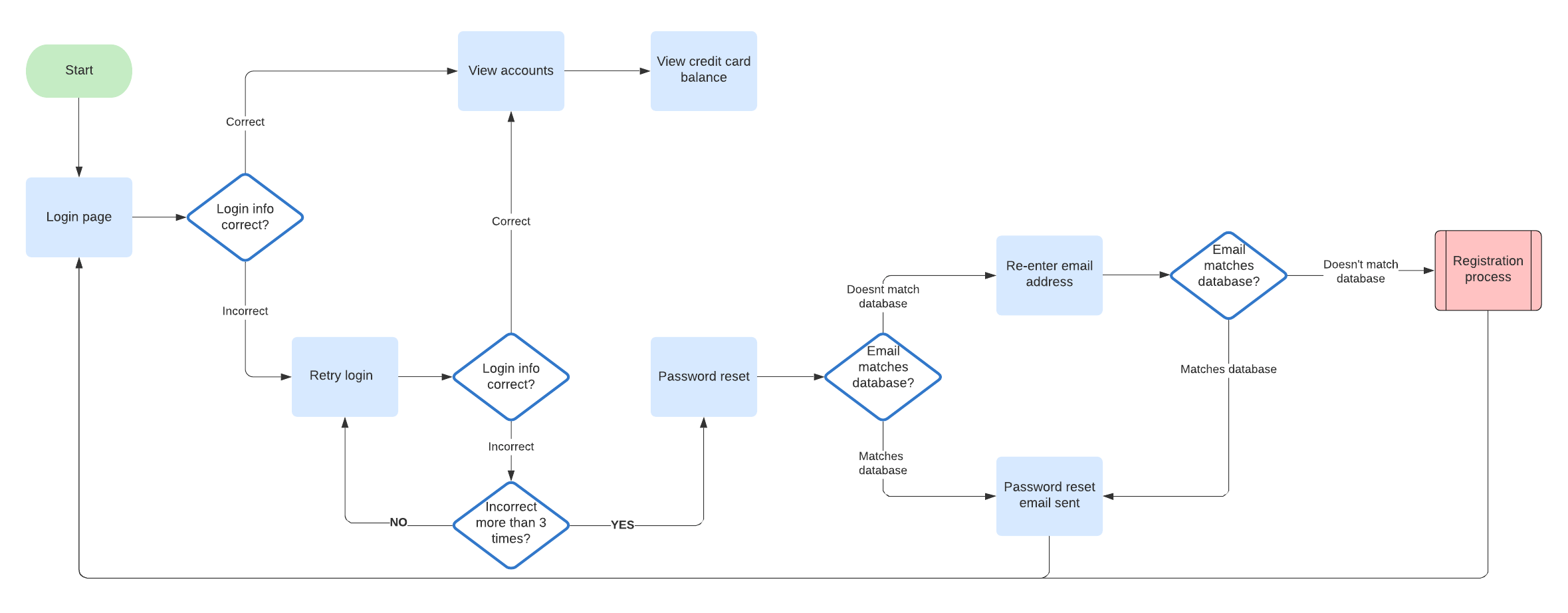
This was an existing app, so I started by analysing its flows and visual design. Then I simplified the journeys, made them more intuitive and lifted the look of the whole app.
Onboarding mattered most, so a smooth first experience was the priority.
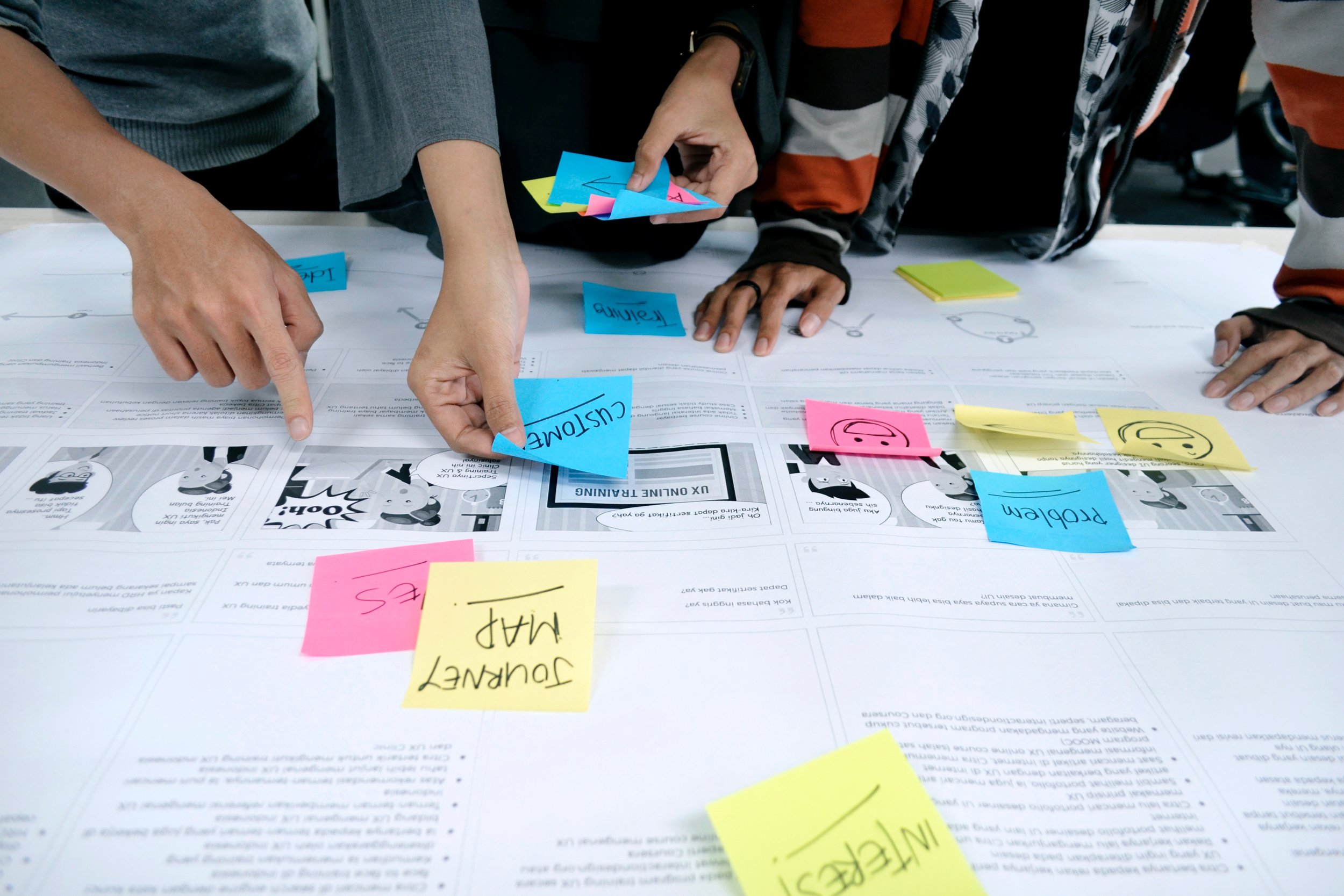
Early exploration
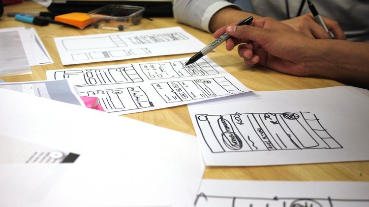
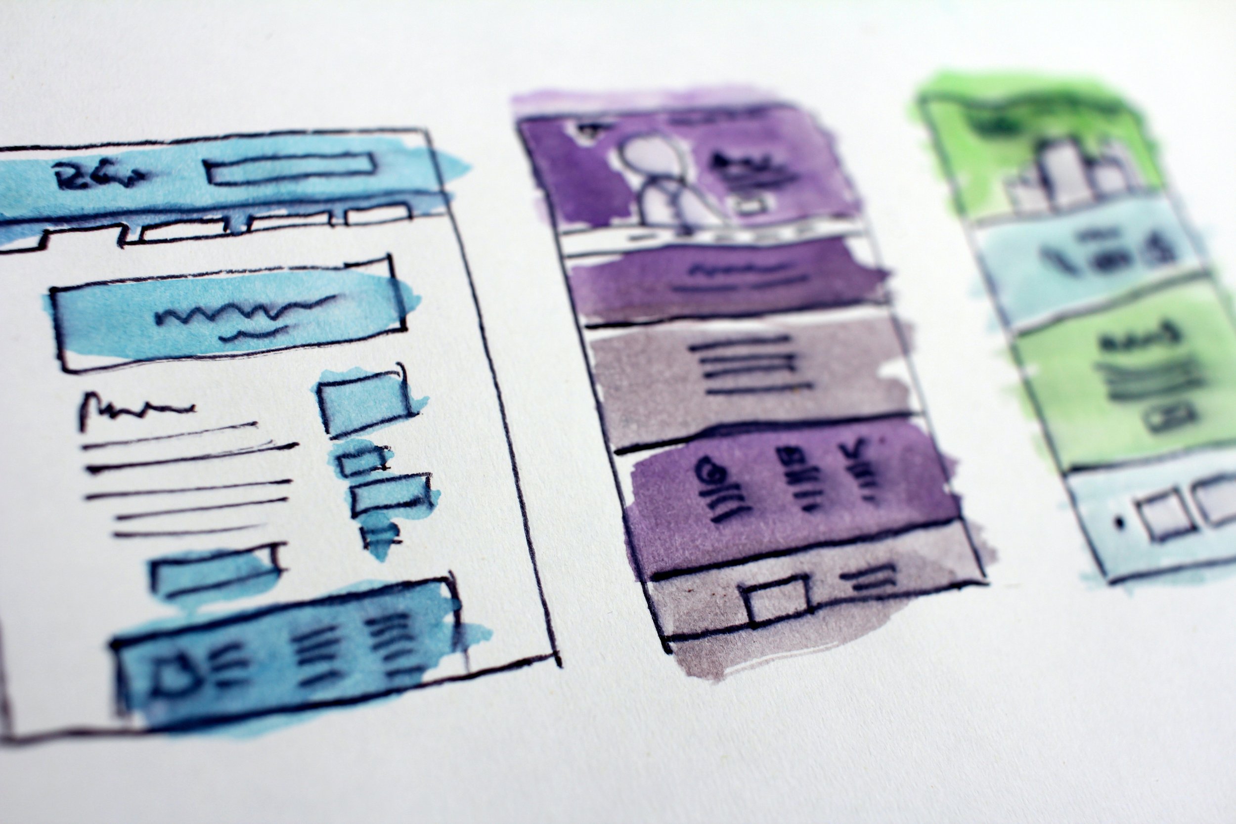
I immersed myself in the goals, the audience and the brand, then gathered ideas through research, sketching and mood boards. I tried different colour palettes, type styles and layouts to set the visual direction, iterating towards a balance of creativity and usability.
Prototype, then test with real users
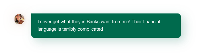
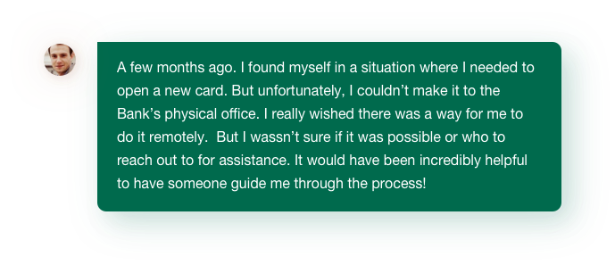
We built a prototype and tested it with real users to check it worked as a solution. Watching people use it showed us their behaviour and preferences, and we refined the design based on what we saw.
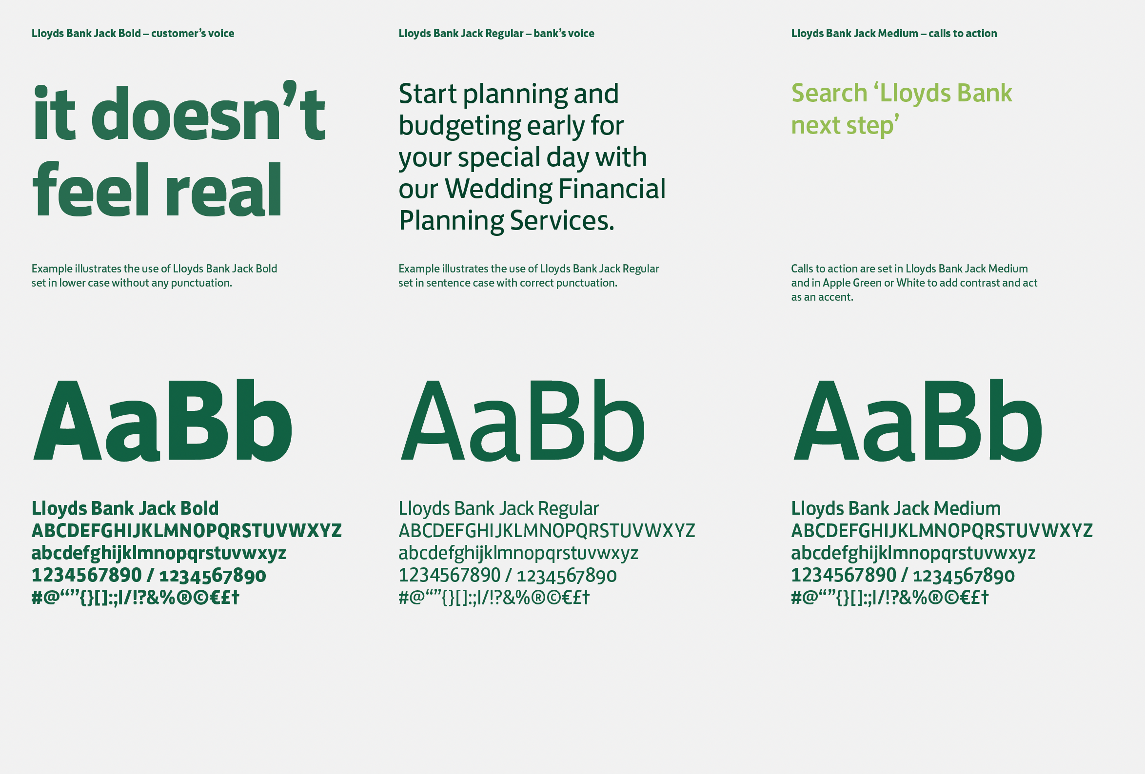
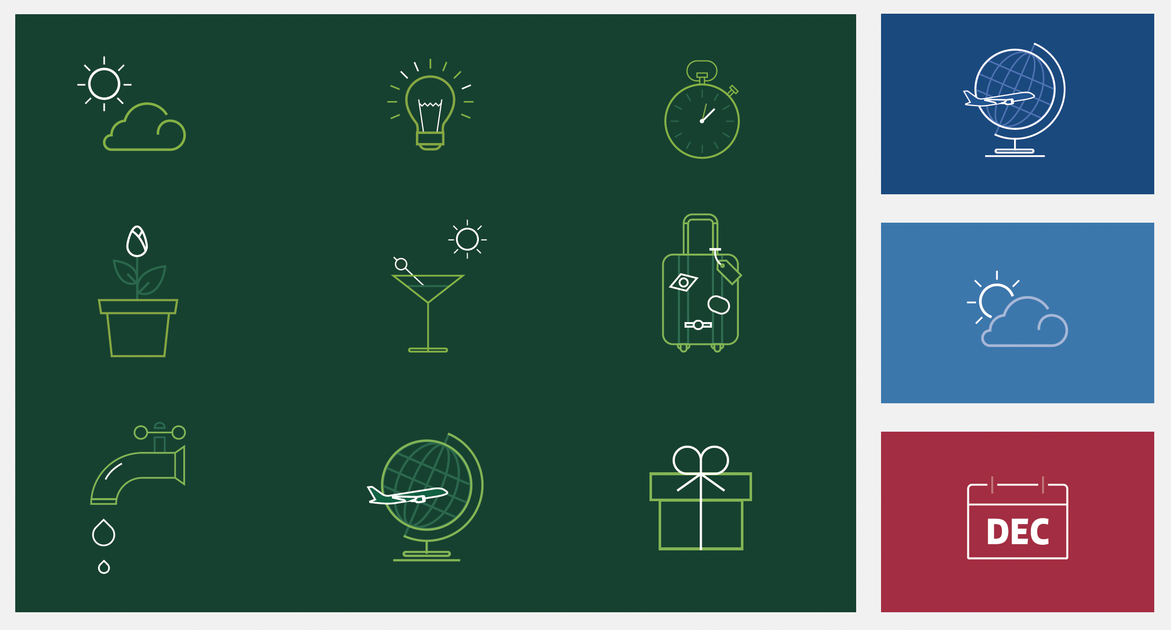
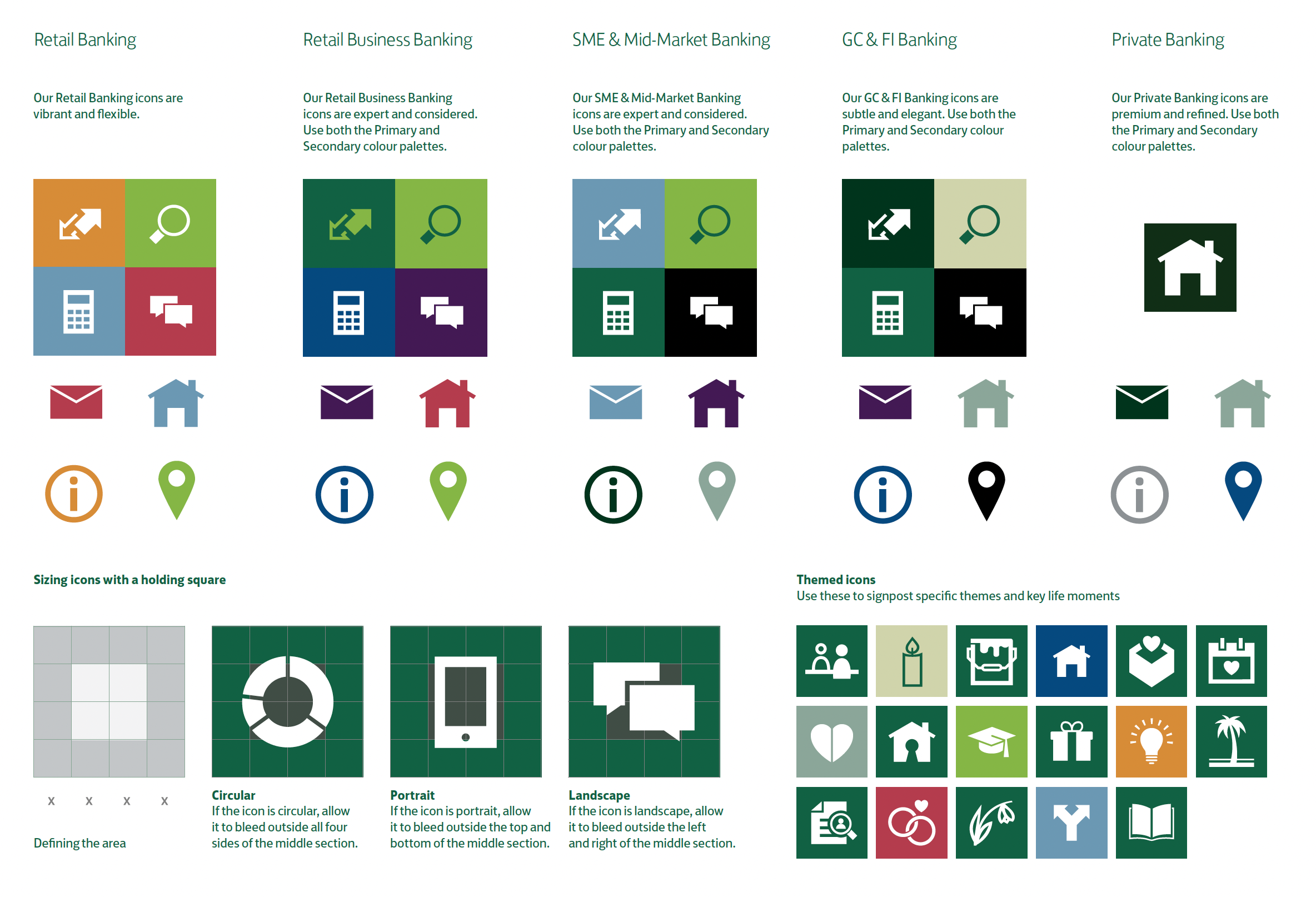
Designed with a system
Defining the basic elements up front kept the design fast and consistent, and made later style changes easy to roll out.
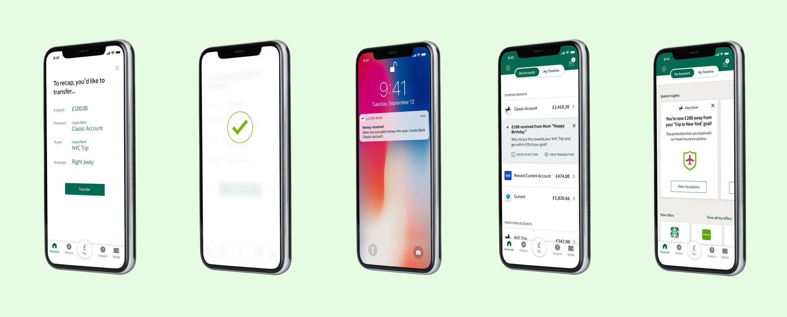
Sending and receiving money had to feel seamless and secure, whether to friends, family or businesses.
What I learned
The hardest part was balancing progress on the designs with working well with the wider team. The project touched many parts of the bank, so I needed support from teams in several locations.
Feedback was harder still. Views went back and forth, and without enough data the team spent too long debating decisions.
So I wrote documentation that explained the reasoning behind design choices, rather than leaning on data alone. Clear design principles and a content prioritisation framework made my decisions visible and got the team behind one vision. It took time up front and saved far more later.